Friction at the gate
May 19 2026
Scanners are everywhere. Supermarkets, airports, train stations. A barcode, a ticket, a fingerprint, a face. They're so normalized that we barely think about them anymore.
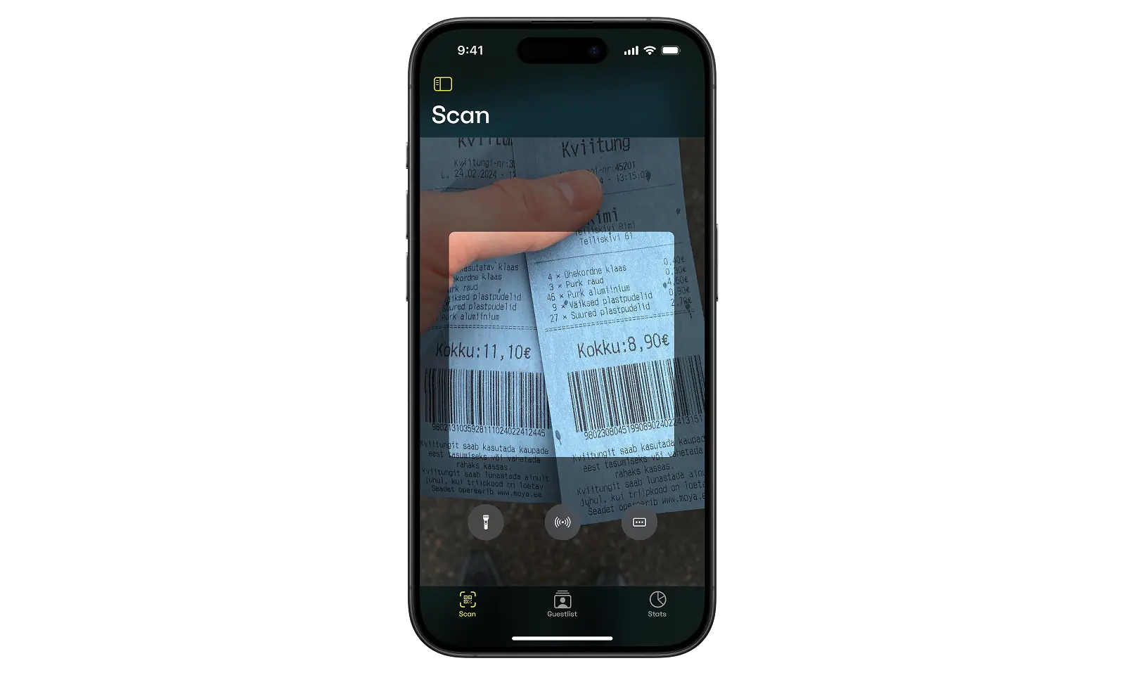
A couple of years ago I worked on a project to design a scanner for a ticketing platform. Simple stuff, an app on a phone. Scan via camera and NFC. At first glance this was straightforward, many have solved it before.
Once I started listing out the constraints and dug into what people were saying about the previous scanner, the list of variables started to add up pretty quickly.
| Variable | Description |
|---|---|
| Lighting | day / night / artificial light |
| Event duration | short event / multi-day festival |
| Devices | phone / tablet / old hardware / damaged sensors / no NFC |
| Network | wifi / cellular / offline |
| Battery | draining / charging |
| Power use | camera / flashlight drain |
| People | various ages / skill levels / experience |
| Ergonomics | one-handed operation / limited reach |
| Accessibility | large type / large touch targets |
| Pressure | queue / crowds / time-sensitivity |
| Human behavior | impatience / distraction / fatigue |
| Reliability | duplicate scans / failed scans / recovery flows |
Apart from the technical challenges, what i also noticed was the users operating the scanners. Different age groups and skill levels, ranging from young adults to retirees. Motor skills, familiarity with the device, and finger reach all became considerations.
My early prototypes were probably a bit too focused on the technical challenges and optimizing for fast development. Some early feedback and observations made it clear that this wasn't enough.
Friction
In its natural environment, where ticket scanning takes place, it wasn't really the device people were struggling with, rather the queue. People waiting are impatient and operators feel that pressure. A stressed operator is more likely to make mistakes, skip instructions or improvise on the spot.
So the scanner had to be fast, verbose and intuitive so that the operator wouldn't have to think about it. And things will surely go wrong: a duplicate scan, an invalid ticket, an ID check, it has to tell the operator exactly what to do next.
Decisions
From a technical standpoint the main challenges were energy conservation, network instability (an event with 5000 people will impact the network), and performance.
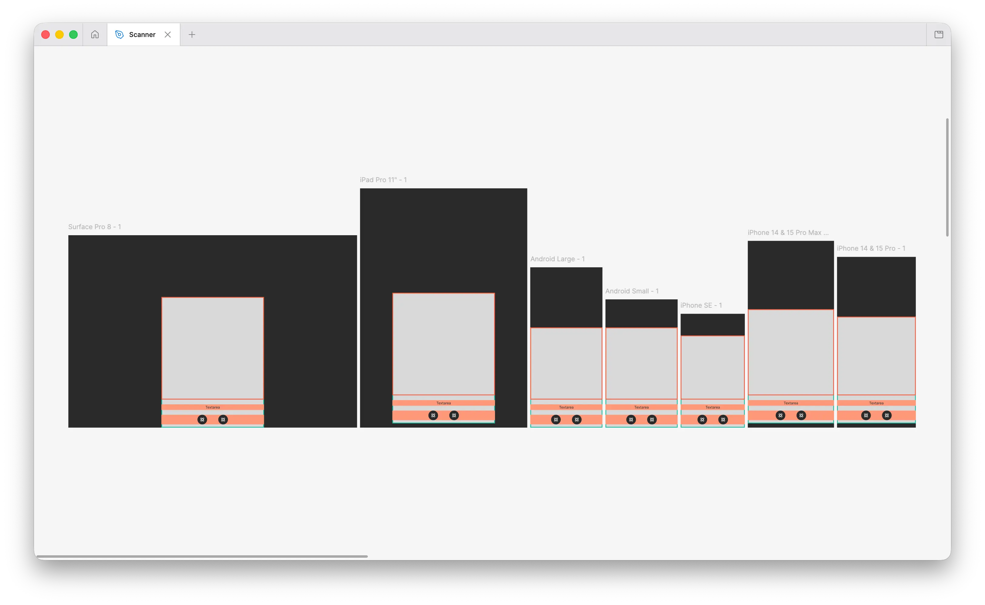
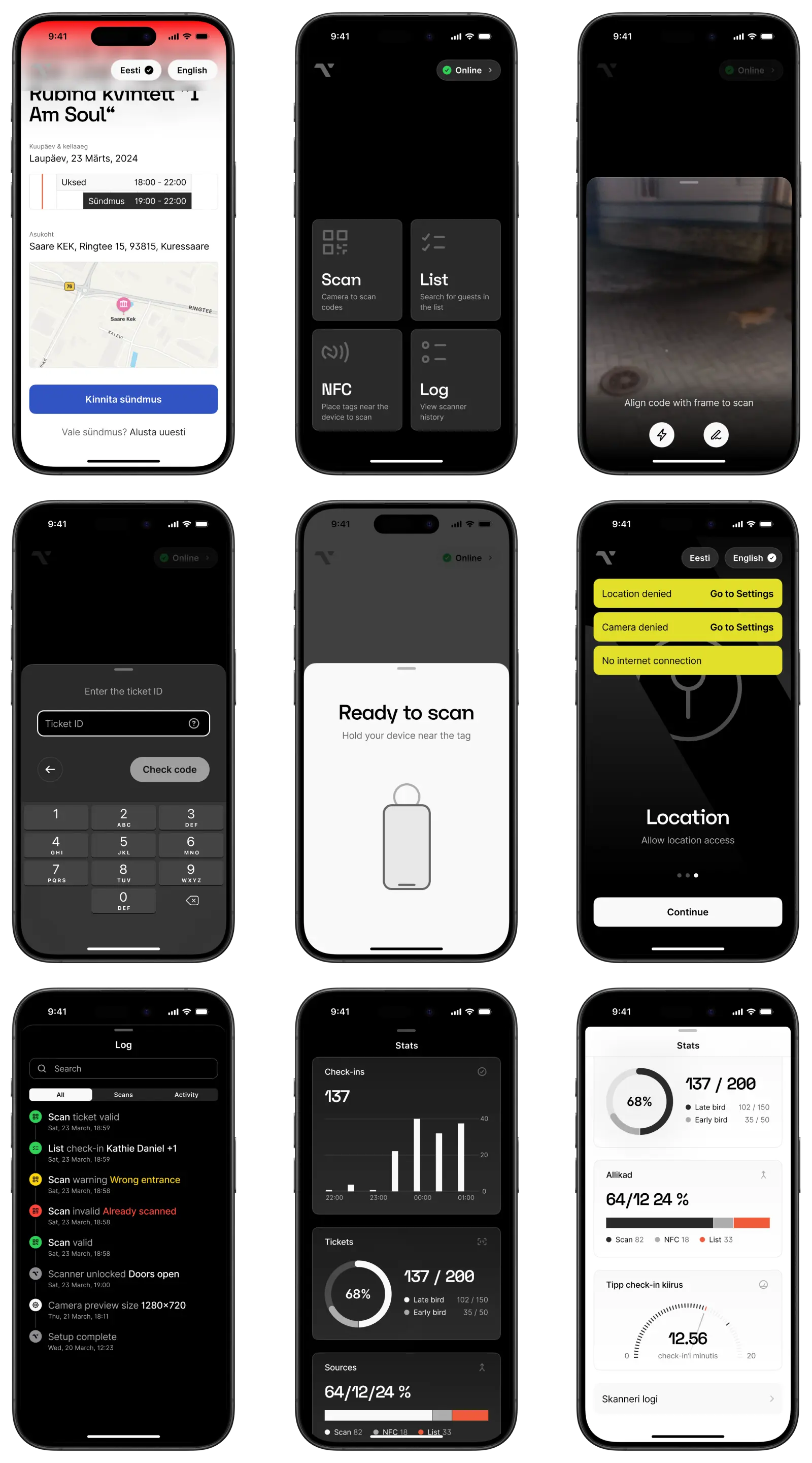
The user experience had a lot to do with finger reach, I spent quite some time figuring out how to make the scanner usable with just your thumb, as well as legibility across different environments, a sunny day versus a totally dark nightclub. High contrast and large touch targets were essential from the start, given the wide range of ages and abilities we needed to support.
I also prototyped haptics, I borrowed the patterns from Apple Pay, using distinct vibrations for success, warning, and error. It's a pattern that is easy to grok once you've used it. ProTip: on an iPhone you can prototype custom haptic patterns under Sound & Haptics in Settings.
The technical constraints also made a really solid case for having an idle state. Reducing battery drain was the main reason, but it also offered a "home" view to access the scan modes, guestlist and activity log. I landed a 2×2 grid of oversized buttons, like an MPC drumpad. Large labels, large targets, everything within thumb reach.
The space above the grid wasn't wasted either. It would display a countdown until gates opened or warnings / permission errors. The ample space meant errors could stay on screen without interrupting other operations.
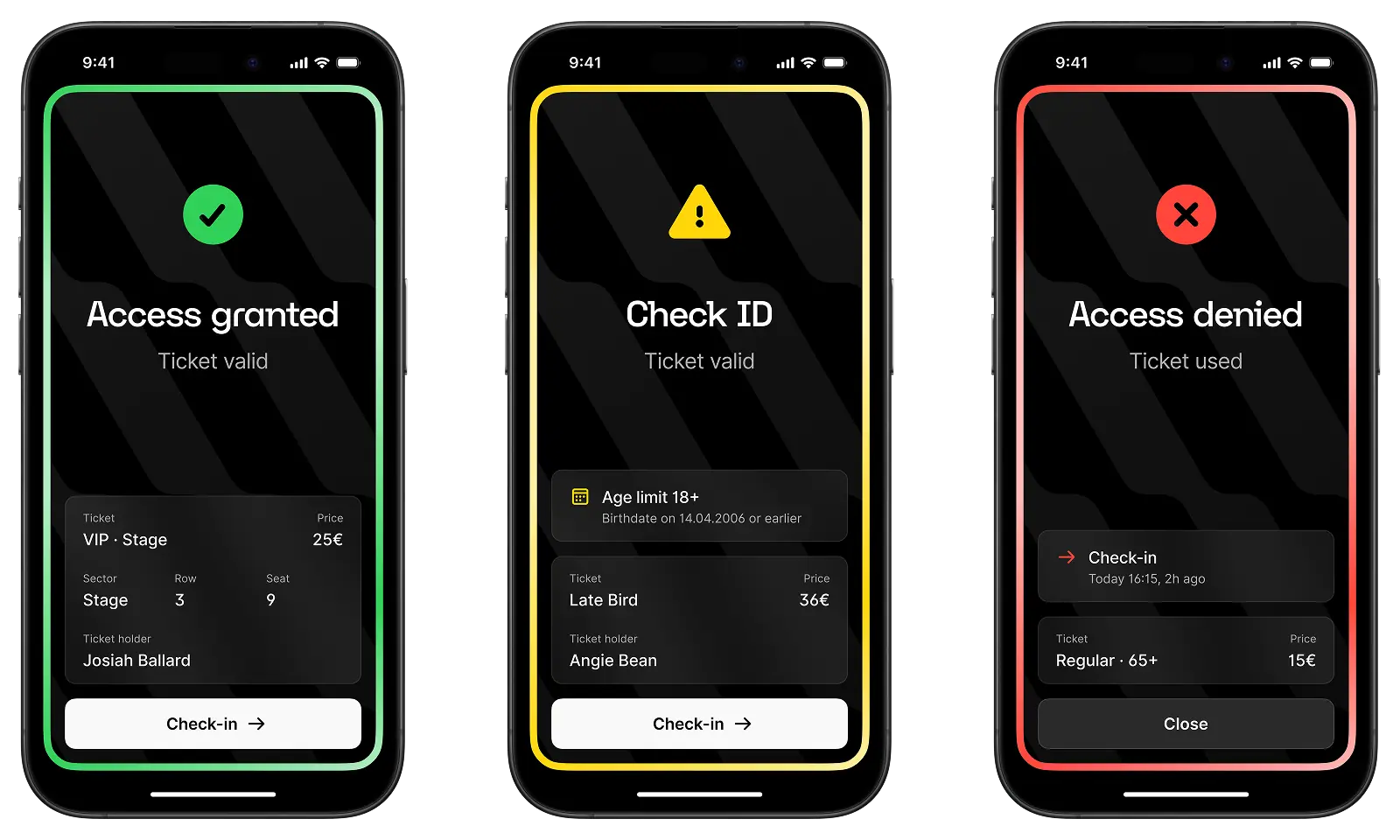
I tested numerous variations of the scan result itself. Many scanners I looked at turned the entire screen red or green to communicate the scan result. This felt harsh, especially in dark environments. A bright red full-screen image in the middle of a dark nightclub is blinding.
I opted for a simple border around the screen instead, spelling out the result of the scan and if there's an action the operator should take.
What rounded out the application was a list management system and an auditable log of scanner activity, available on the device and synced to a web dashboard. Even relatively small event organizers want visibility into what happened at the gates, even more so once multiple scanners and operators are involved.
One thing I did skip was on-device reports. Partly because of development cost, but mostly because exposing that data directly on scanning devices introduced additional concerns. There was also an unexpected dynamic i got wary of, for example,surfacing scans per minute would create a competitive behavior between operators.
The app has been running at events for about 2+ years now. Operators don't have to think about it, which was kind of the point from the start. Haven't tested it with my own grandma yet but the business owner said he had success with both his kids and parents.